My setup
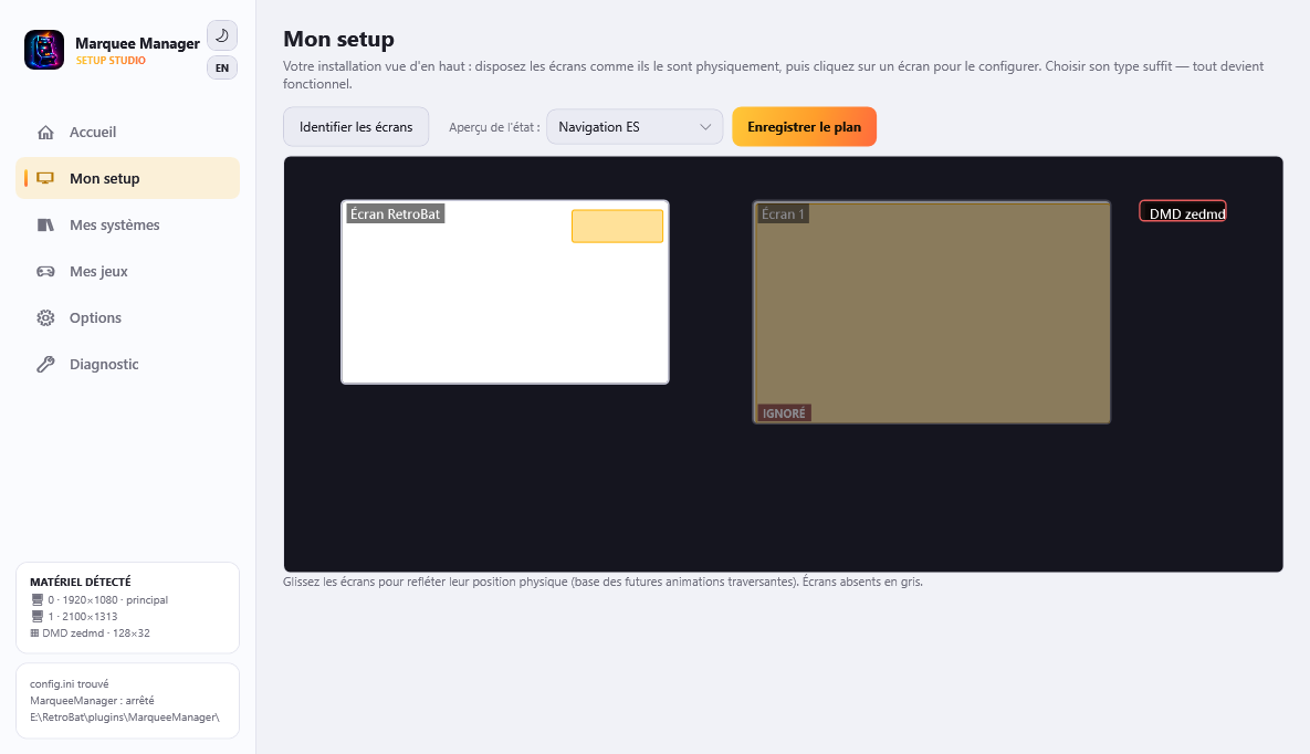
My setup is the map of your installation: every detected screen appears where it physically sits (drag them to mirror your cabinet, cupboard or desk). From there, everything configures top-down: the map → a screen → a surface → its graphic creation.
One screen type = everything configured
Click a screen, pick its type, apply: default surfaces, components and streams are laid out - the screen works immediately.
| Type | What gets laid out |
|---|---|
| Marquee | Fullscreen surface: game media, lighting render (neon tubes), lamps, hiscores, live score/timer, RetroAchievements |
| Topper | Fullscreen topper surface |
| Instruction card | The game's instruction card (touch supported when the screen is) |
| Virtual DMD | A fullscreen DMD window |
| Mixed vertical | Marquee strip on top + instruction card at the bottom, RetroBat/the game stays visible in the middle |
| Game screen | Nothing: RetroBat owns it |
| Custom | An empty surface to compose |
The tool pre-suggests the type from the screen's shape (a 5:1 strip is probably a marquee). Experts then tweak anything: “Split / position surfaces” opens the visual zone editor (drag, resize, magnetic guides), including on the main screen.
Display states
Every surface and every component belongs to a state: ES browsing, Ingame, or both (default). An “ingame only” surface disappears entirely while browsing - e.g. nothing over ES on the RetroBat screen until a game runs. The state selector above the map previews what each screen will show in each situation; a surface's state is set in “Edit the surfaces” (Visible in: …).
Map navigation
A first click on a screen selects it and shows its details below; a second click opens the surfaces editor. The physical DMD appears as a map screen (draggable, red outline) - its second click opens its settings.
A surface's graphic creation
A surface's “Configure” button opens the graphic creation interface, Photoshop logic:
- left, the elements by groups: media (fanart, 50 % logo, game video…), game info (title, year/publisher), live (hiscores, score, timer), RetroAchievements, decoration (readability gradient, text, embedded web, neon tubes) - plus one-click composites: Marquee (fanart+gradient+logo), Full score, Live media, Twitch chat;
- center, the canvas at the surface's real scale: drag, resize handle, magnetic guides, Del, Ctrl+D (duplicate), Ctrl+Z/Y (undo/redo) - with a real example game's media;
- right, the layers (eye to hide, padlock to lock, ↑↓ for z-order) and the inspector: layout (x, y, width, height as fractions - the creation survives any resolution change), content (visibility state,
{name}{year}templates…), style.
The ES browsing / Ingame tabs at the top filter editing per state. A layer's eye means “shown in THIS state”: 👁 it is, ◌ it is absent from this state but present in the other, - it is off everywhere.
Four layers are pinned and cannot be deleted: Animated events, Lamps and Lighting at the top, the Game image at the very bottom. They cover the whole surface by definition and therefore do not move. Switching one off does more than hide it: its engine is not built and costs nothing at all.
The live score, live timer and RetroAchievements overlays belong to the Ingame state only: there is no score and no session to report while browsing. Their eye only switches them on or off.
A well-placed fanart
The Fanart preset covers the whole frame; the readability gradient sits above it and the centered logo takes 50 % of the width - the generated-marquee recipe, now editable.
Live video
The video component can follow a live Twitch stream > YouTube > local video chain: if a live stream exists for the displayed game, it takes the video's place. Credentials in Options → Online sources; without keys, the local video simply shows.
Text layers
Meta text shows the selected game's data through a template: {name}, {year}, {developer}, {publisher}, {system}, and everything else the entry carries - {desc}, {genre}, {players}, {rating}.
Type size defaults to auto: the text fits itself to its zone. That is what lets one layer carry a game name or a 1,500-character description without being told which. Set by hand, the size is a fraction of the surface height - so it keeps its size when you resize the zone.
The rest (Style group): alignment left / centered / right / justified, vertical position top / middle / bottom, and weight bold or normal - a 1,500-character description in bold is a wall.
The control panel
The Control panel component (Live palette) draws your cabinet's panel, with what each button does in the selected game - being on its card in ES is enough, nothing has to be launched.
And above all: press a button on the cabinet and it lights up on the panel. That is a full wiring check, working with LedManager not installed. If the neighbouring button lights instead, the wiring is not what your cabinet declares.
Its options (inspector):
- Panel (Content group) - Player 1 to 4. One component = one panel: a two-sided cabinet places two, each set to its own side.
- Look (Style group) - Top view and 3D front view show APIExpose's real artwork, the very drawing it writes for EmulationStation themes; Plain draws shapes. With no drawing available for a game, the look falls back to the shapes rather than to an empty frame.
- Background - none, black, white, red, yellow or blue, with its opacity and padding on sliders. The artwork is drawn on transparency: over a busy fanart, a veil makes the buttons readable.
Buttons the game does not use stay visible, faded: the panel tells the truth about the cabinet, not about the game. They still light when pressed, in white - having no colour of their own to answer with.
The light
A press lights a coloured lamp, like the lighting engine's own: the button's colour, a soft halo, no outline. It stays lit for a minimum time even on a quick tap, then fades out - otherwise a rattle of buttons would read as flicker.
Instruction cards
Many cabinets show the game's instruction card: special moves, items, bonus points. Two layers carry it, and they are separate on purpose - on a cabinet, the touchscreen and the screen showing the card are rarely the same one.
Instruction card (Instruction cards palette) shows the selected game's pages. Its options:
- Player - who this card is for. All players for a shared card.
- Displayed role - Every page, Items and weaponry, Bonus points or Vitality. These are the only three roles that run across the library: topic pages carrying the same name from one game to the next. Characters are not there - they only exist in their own game, and the auto mode is what follows them.
- Follow the character the game announces - when the game can tell who was picked, the card switches to that character and cycles through his pages only.
- Resting card - The first one, or page 2 to 8. A game without that page falls back to the first.
- Auto return - never, 3, 5, 8, 15 or 30 seconds before coming back when a zone showed another one.
- Announced item - Frame the entry, Frame it and dim the rest, or Signal nothing.
When the card does not change, the entry lights up
Some games hold everything in one drawing - the weapons of Ghouls'n Ghosts side by side. There is no card to switch to: when the game announces the weapon you just picked up, that entry gets framed on the card. The frame goes away as soon as a zone is touched: a frame pointing at what the player no longer holds is worse than no frame.
Touch zone is the layer you press. Its rectangle is the zone: what you draw is what a finger can touch. Its options:
- On tap - next page, previous page, back to the resting card, next role, previous role, or follow / stop following the game. Every action works on any game: naming a page or a role was possible and was dropped, because "page 2" holds the weapons here and the bonus points there, and a character only exists in its own game.
- Background and Outline the zone - nothing is drawn by default: a touchscreen that works needs no marking. The background (black, white, red, yellow, blue, with its opacity) is for cabinets whose players do not know the zone is there.
- Auto return - never, 3, 5, 8, 15 or 30 seconds before going back to the resting card.
The channel, to bind the two
A zone drives the card carrying the same channel. The channel follows what the layer already says - its player, otherwise its role - so an ordinary cabinet has nothing to name: a card set to Player 2 and a zone set to Player 2 answer each other. The Channel field only matters for free-form setups: a touch strip on the marquee scrolling tips shown on the topper, for instance.
Where the pages come from
From the game's media folder, under artwork\ic: ic.png at the root, or artwork\ic\<role>\ic-1.png for a page belonging to a character or a topic. The folder name is the role.
The score board
The Hiscores component shows the current game's leaderboard. Its options (inspector, Content group):
- Source - Local hiscores (scores captured on the cabinet), NelfePlay (online) (the game's certified world Top 100), or Both: the two boards show one after another (world first), displaying only the one that has data.
- My best rank - under each board, a line recalls your position: locally, your best line for the game; worldwide, your certified rank (or a prompt to identify on NelfePlay). The label is customizable (
{rank} {of} {score} {pseudo}) and localized. - Rows per page - a free number, or Dynamic: the count fits the available space (a wide, short marquee shows few; a taller zone more). Beyond N rows, the board cycles page by page.
- Alignment - the board sits at the top / middle / bottom of its zone.
- Rank/score colour - gold by default, a fixed colour, or Auto: a vivid colour pulled from the game logo/marquee.
- Title -
{name}(or justgamename) = game name; the title is decoupled from the list (a long title no longer shrinks the score). - A faint local / world watermark at the bottom tells which board is on screen right now.
Test patterns, identification, DMD, touch
- Identify screens shows a big number on every physical screen.
- Show test pattern fills the selected screen with an adjustment grid.
- Physical DMD… opens the real panel settings (ZeDMD, Pin2DMD… see DMD and ZeDMD).
- Touch is configured in the composition, not here: drop a Touch zone layer where the finger must answer. A tap and a mouse click do the same thing - handy for testing without a touchscreen.
Card naming (APIExpose media)
In a game's artwork\ic: ic.png for a single card, or ic-1.png, ic-2.png… for several. The -left/-right suffixes (e.g. mercs: ic-1-left.png … ic-5-right.png) are the panel's two card holders: player 1 side and player 2 side. Navigation moves card by card, and dual player mode shows the side of the player who tapped.
Under the hood
The map and surfaces live in state\surfaces.json (physical positions will drive future cross-screen animations). A legacy [Screens] configuration converts automatically on first launch with identical behavior; an unplugged screen stays on the map, grayed, and recovers its settings when plugged back. If APIExpose restarts, every stream reconnects by itself after five seconds.